T-Mobile
The Un-Carrier Plan Change
Reframing plan change from a transaction into a conversation - clearer structure, fewer drop-offs, better decisions.
Overview
T-Mobile’s Info Center allows customers to review and change their mobile plans across devices. But the experience wasn’t working. People struggled to compare options, understand trade-offs, or feel confident about completing the process.
This project focused on rebuilding the plan change flow into a more structured and human-centered experience. The goal was to help people make clearer choices, not just push them through the funnel.

ROLE
UX Designer
DURATION
5 Months
TEAM
3 UX Designers
1 Product Manager
1 Business Analyst
3 Developers
UX Designer
DURATION
5 Months
TEAM
3 UX Designers
1 Product Manager
1 Business Analyst
3 Developers
Problem
The legacy design centered on internal logic and business constraints. It didn’t reflect how real users think when deciding between plans.
Main issues included:
-
No clear before-and-after comparison
-
Information buried in long, unreadable layouts
-
Users unsure what they were gaining or losing
-
High drop-off during key moments in the flow
Business stakeholders wanted a smoother, more efficient conversion path. Our task was to create clarity without losing important backend requirements.
Process
Principles
We aligned around three key principles from the start:-
Show what’s changing
-
Keep the structure scannable and digestible
-
Help users make informed decisions, not just go through steps
User Persona
We explored the user experience challenges faced by two key personas at T-Mobile:
Customer Service Representative and the Customers.


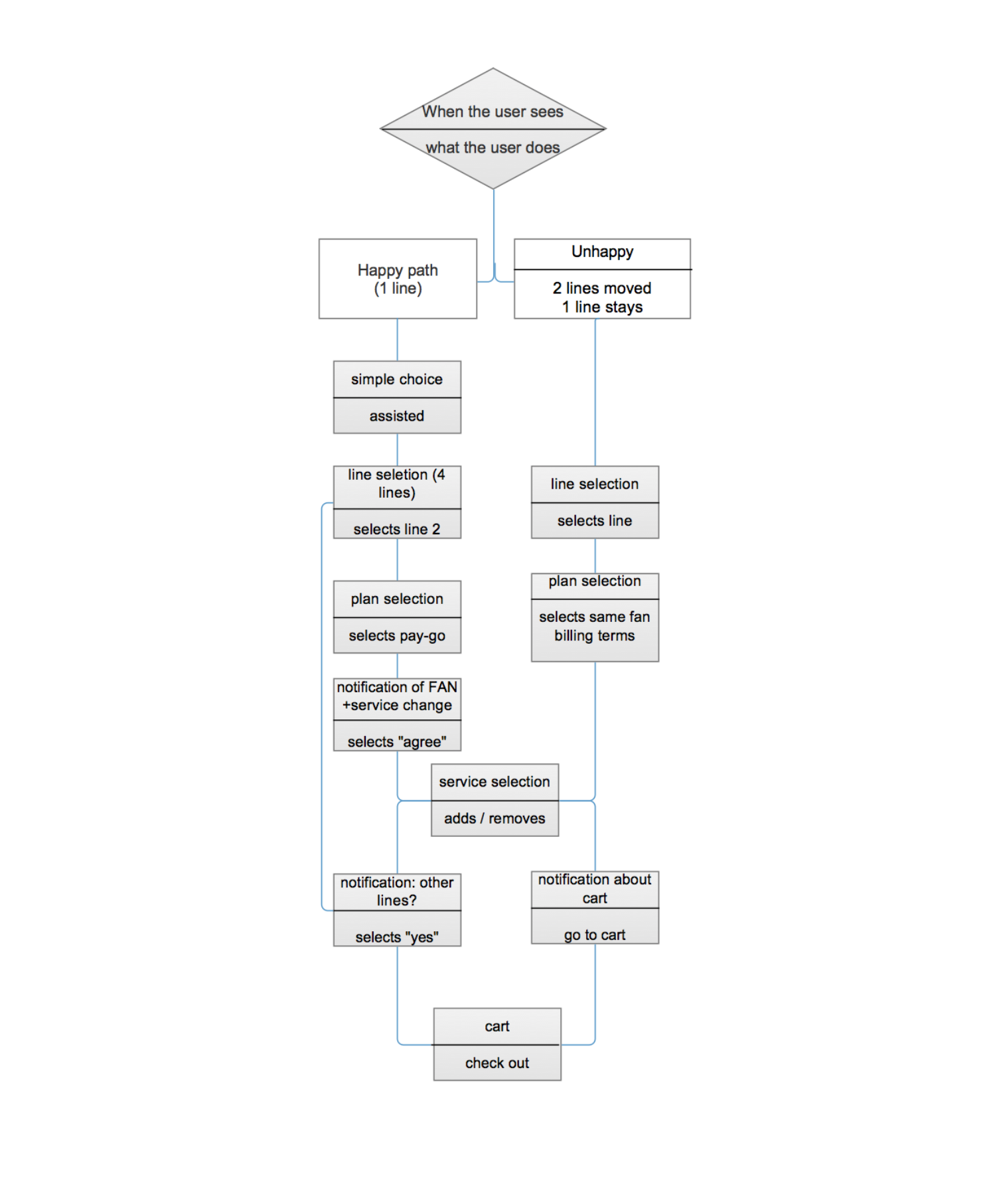
User Flows
Working closely with PMs and developers, I mapped out new decision paths based on real user questions and edge cases.
We rebuilt the structure so users could clearly see their options, compare plans, and understand how a change would affect them. The layout was broken into defined steps to reduce confusion and avoid overload.
Scenarios
Customer (unassisted):
A family with two children (two lines) needs to switch to different plans and services.
Reps (assisted):
Customers require assistance changing plans/services from pre-paid to post-paid for their children.
User Research
We tested prototypes with actual customers and internal reps.
What we heard:
These insights shaped everything from copy tone to the visual structure of the plans page.
Mapping & Collaboration
We held multiple whiteboard sessions to visualize pain points and restructure decision logic.
Sticky notes, decision trees, and live user scenarios helped surface breakdowns in the flow and guide a better architecture.
We tested prototypes with actual customers and internal reps.
What we heard:
-
People didn’t trust the summaries
-
They wanted to see the differences spelled out clearly
-
Reps were constantly re-explaining what the interface didn’t make obvious
These insights shaped everything from copy tone to the visual structure of the plans page.
Mapping & Collaboration
We held multiple whiteboard sessions to visualize pain points and restructure decision logic.
Sticky notes, decision trees, and live user scenarios helped surface breakdowns in the flow and guide a better architecture.


Result
The redesigned plan change flow was launched successfully and demonstrated measurable improvements:
-
Reduced user drop-offs, especially in step 2
-
Decreased support tickets related to plan changes
-
Improved customer satisfaction in related NPS metrics
More importantly, the updated flow became easier for support agents to walk through with users, reinforcing trust and reducing confusion across channels.


.
Reflection
This project underscored the importance of aligning product structure with how users actually make decisions. Rather than pushing users through a transactional sequence, we focused on transparency, sequencing, and progressive trust-building.
It was a strong example of how thoughtful UX strategy and design clarity can directly improve both the user experience and business outcomes.